Posts

Showing posts from 2019

'What if?' Metropolis Reflective Statement.

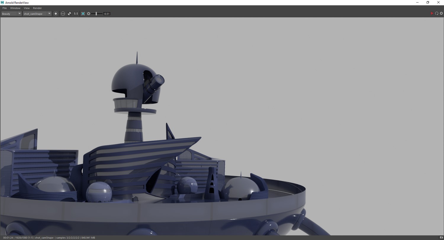
Throughout the 'What if?' Metropolis project, I have found areas of the modelling to be quite difficult in terms of forming the correct shapes to match that of  the orthographs I had previously drawn out for the model. This due to there being a lot of organic shapes within my buildings infrastructure,  which then I found caused problems when it came to UV-ing the models as some had 'non-manifold geometry', meaning it couldn't be unfolded easily; meaning I then had to go back and clean up the mesh so that the UV's could be unfolded accordingly. In addition to this I feel slightly more confident in modeling in Maya, as before I had never digitally 3D modeled anything. so I am pleased with the outcome produced since this way of working is all new to me. In future however I will consider looking at more complex textures, as at the moment within my current scene I find it lacks that extra bit of depth and dimension, this due to not allowing myself that extra bit of

‘What if?’ Metropolis. – Crit Presentation.

‘What if?’ Metropolis. by Jasmine Masters on Scribd

‘What if?’ Metropolis. – ‘Art Of’.

‘What if?’ Metropolis. – ‘A... by Jasmine Masters on Scribd

Matte Painting in Progress and the final outcome.

Image

‘What if?’ Metropolis. – Pipeline.

‘What if?’ Metropolis. – Pipeline. by Jasmine Masters on Scribd

What if? Metropolis - test renders.

Image
Here I took some test renders ready for when I start matte painting onto the image. render 1 render 2 render 3 render 4 -final render

Baucis - Travelogue

You don’t simply stumble across the city of Baucis upon a whim, it takes a seven day trek through the Baucisian woodland in search for the city on slender flamingo leg stilts; hidden within the troposphere of the earth’s atmosphere where the cloud fog your vision to what lies above. To surface the city there is an unsteady climb through its exiguous supports as it twists and turns like a spiral up through the centre shaft, and when you feel like you finally reach the peak of your climb you have yet to go further still. With curved ladders running up the body of the city to the opening, be sure to take every step with a bit of caution as one wrong misstep may cause you reach your demise sooner than you would like. Baucis structural position is so that that earth below can grow and prosper; as if it was never touched by mankind alike. The Baucisians love the earth; they adore it through telescopes and spyglasses with much to observe but never to touch as it is believed humanki

Life Drawing with a Model 7

Image
1. 5 Minutes quick draw. 1. 5 Minute quick draw. 2. 20 Minute Sketch.  3. 20 Minute Sketch.  4. 15 Minute Sketch.  5. 15 Minute Sketch.  6. 15 Minute Sketch. 

Maya Brief 2 - Set Design: Texturing, rendering and compositing (light wrap) the Scene - ‘Pipeline’.

Image
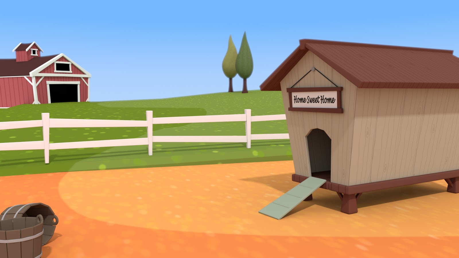
Maya Brief 2 - Set Design: Texturing, rendering and compositing (light wrap) the Scene - ‘Pipeline’. by Jasmine Masters on Scribd Final Outcome.

Quick Draw.

Image
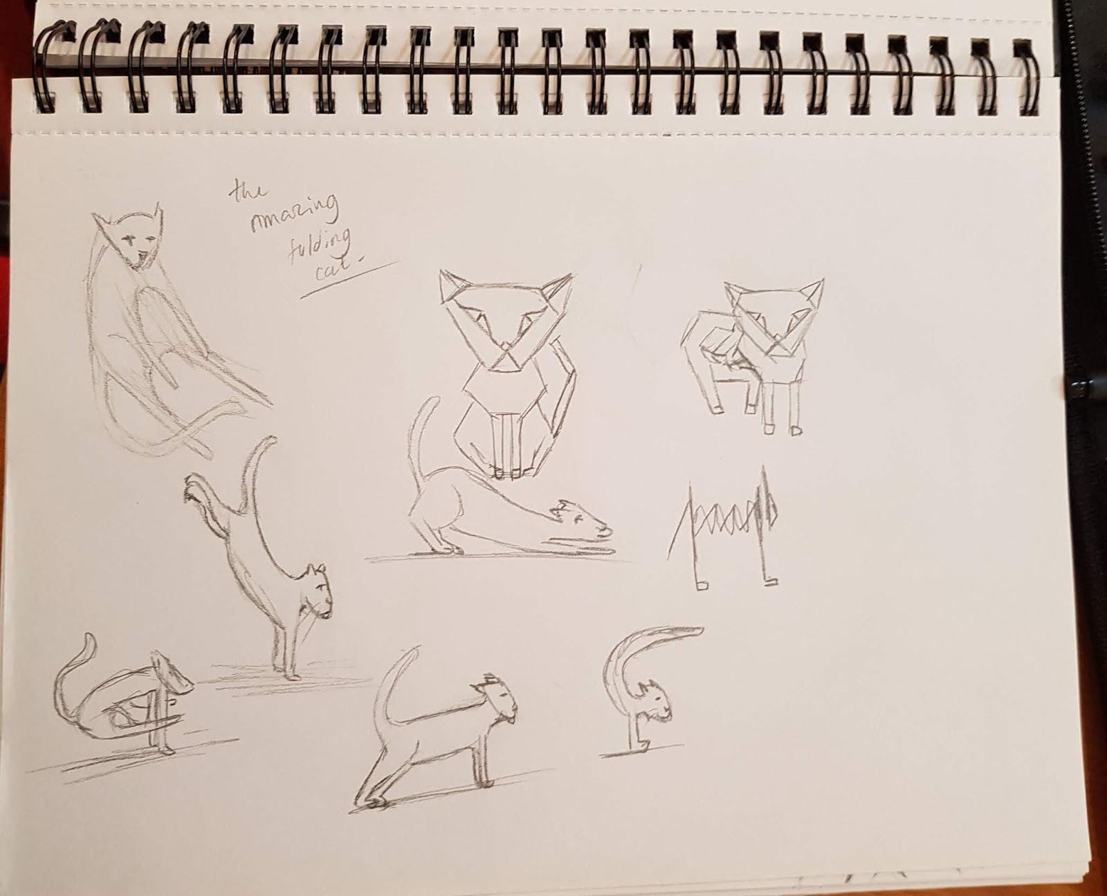
The Amazing Folding Cat -  Went with the idea of a flexible acrobatic cat or a origami concertina cat. Alien worlds  The Reptilian Jaguar - For this concept I looked at merging a jaguar with a bearded dragon to create something that's fast, agile and good at climbing. Minotaur - Here I was given the word Minotaur and then had to create my own interpretation of the word. Keeping with the idea of a man crossed with a bull; I then decided to show how the Minotaur may be fed up with constantly killing, so showed a lighter side of him enjoying himself. Dire Wolf with big teeth sitting near their human in a protective manner - Here I combined the idea of a sabertooth tiger with a wolf and positioned such creature over looking it's human and cub. The Detail Shot (Close-up objects) - For this one I looked at random objects around and in front of me to create a close-up in the style of a Polaroid that would then be suitable for an Instagram post.

Run Cycle Animation

Image
In this exercise I looked to create a basic run cycle using methods learnt from doing the prior walk cycles. This included using a squish method on the parts that are down (bent knees) and stretch on the parts that are up (straight knees), as well as ensuring the follow through and timing in the short can be as accurate as possible.

Maya Brief 2 - Set Design: Making the Scene - ‘Pipeline’.

Maya Brief 2 - Set Design: ... by Jasmine Masters on Scribd

Maya Brief 2 - Set Design: Making the Fence and Ground plane - ‘Pipeline’.

Maya Brief 2 - Set Design: ... by Jasmine Masters on Scribd

'What if?' Metropolis - Online Greenlight Review.

'What if?' Metropol... by Jasmine Masters on Scribd

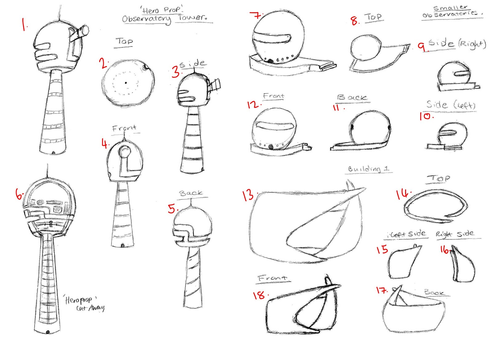
Production Art & Digital Orthographs

Image

Walk Cycle - 'silly walk' Animation.

Image
For this exercise, I looked to expand on my Basic Walk cycle animation and create a 'silly walk' using my actions as reference ready for when I animated it in Adobe Animate. Reference video: Getting the positions before shifting animated frames to put the walk cycle into real time. Silly walk in real time.

Black Narcissus (1947) - Flim Review.

Image
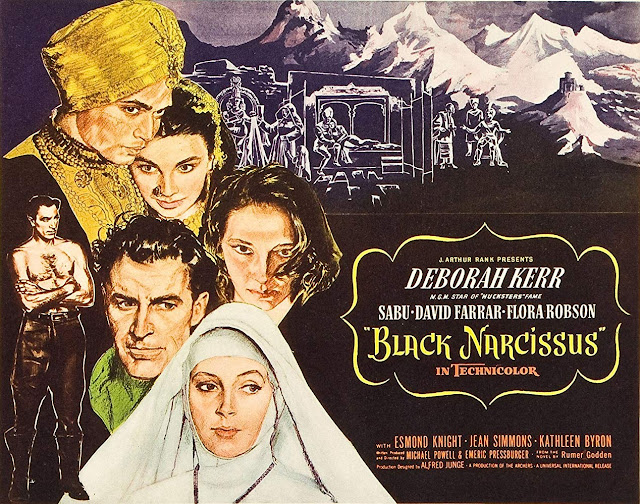
Black Narcissus (1947) was adapted from a novel written by Rumer Godden and was then altered to be a film that was then directed, and screen written by Michael Powell and Emeric Pressburger. The film displays themes of religion, underlying ideas of exoticism and female sexuality as suggested by Tim Dirks “Black Narcissus (1947) is a provocative, dazzling and rich-colored psychological-religious and sexual drama” (Dirks, 2019) that is then portrayed through the convents nun characters as they begin to dwell into personal pleasures whilst residing in the isolated environment the Himalayan mountain side provides. (Fig 1. see below). Fig. 1 Black Narcissus (1947) [film poster, Advertisement] At the time Black Narcissus (1947) was made, World War Two (1945) hadn’t long ended and women being able to work in the workforce had risen since they had been a key part in the war effort; particularly in the labour force as the more men were required to go to war – this included farmer

Maya Brief 2 - Set Design: Applying the UV’s.

Maya Brief 2 - Set Design: Applying the UV’s. by Jasmine Masters on Scribd

Establishing Shot - Orthographic Drawings.

Image

Chosen Shot Refinememts - Establishing Shot.

Image
For the 'What if?' Metropolis project that follows on from Invisible Cities project. I looked to refine my establishing shot so that when it comes to 3D modelling parts of the scene I have as much information as possible to create an informed model combined with a matte painting. For the Matte painting however I will look to improve the current background; which will then allow the model to standout from backdrop. I chose this particular shot because I found it will enable me to use Maya in way that will allow me to broaden my Maya skillset and knowledge; as well as form organic and geometric shapes as seen with the spherical observatories and free flowing buildings that reside within the city. I would also think it'll be interesting to see the outcomes of some of the buildings when put into a 3D space. Process of making. Completed Outcome.

Life Drawing with a Model 6

Image
1. Warm up - 5 Minute Quick gesture sketches. 2. 15 Minute Sketch - Focus on tone. 3. 15 Minute Sketch - Focus on tone. 4. 10 Minute Sketch - Shade and Tone. 5. 25 Minute Sketch - Use of Colour & Direction of the muscles/flow (arrows). 6. 20 Minute Sketch - Colour - flow & Shape.

Basic Walk Cycle.

Image
For this exercise I looked at a typical walk cycle of a person, with this I found it difficult to judge the placement of the leg and arm placements. This possibly due to one leg staying in one position and the opposite moving from one place to the next; when I then started to bring the frames closer together my understanding became more coherent of how to animate a walking character. To achieve the characterized walk sequence I used a curved upper line as well as having two parallel lines to keep the correct height of the person. Through the addition of the curve it allows the character to stand straight when at its full height and shrink when the characters knees bend, creating a 'strutting effect when put into real time. Getting the leg and arm placements right - Creates a gliding Effect. Putting the walk sequence into real time.

Production Designer Research.

Production Designer by Jasmine Masters on Scribd

Edward Scissorhands (1990) - Film Review.

Image
From the creative mind that is Tim Burton comes Edward Scissorhands (1990); directed by Burton and co-written with Caroline Thompson as screenplay writer, together they create a suburban world full of prejudice and curiosity as well as create a visual full of   “special effects and visual tricks to create sights that have never been seen before.” (Ebert, 1990). Within the feature Burton appears to focus mainly on exaggerating suburban life in a small town ranging from the 1950’s to the 90’s and looks at various stereotypes and common archetypal themes that take place in a skewed and distorted society. (Fig 1, see below) Fig 1. Edward Scissorhands (1990) [Film Poster, Advertisement.] Within the feature film, Burton explores the theme of suburbanisation heavily through the mise-en-scene of the street layout, depicting very uniform houses that vary in pastel colours to show individuality of the occupants living there (Fig 2, see below). Through doing so it creates this