Posts

Showing posts from January, 2021

Introduction to Premise.
Image
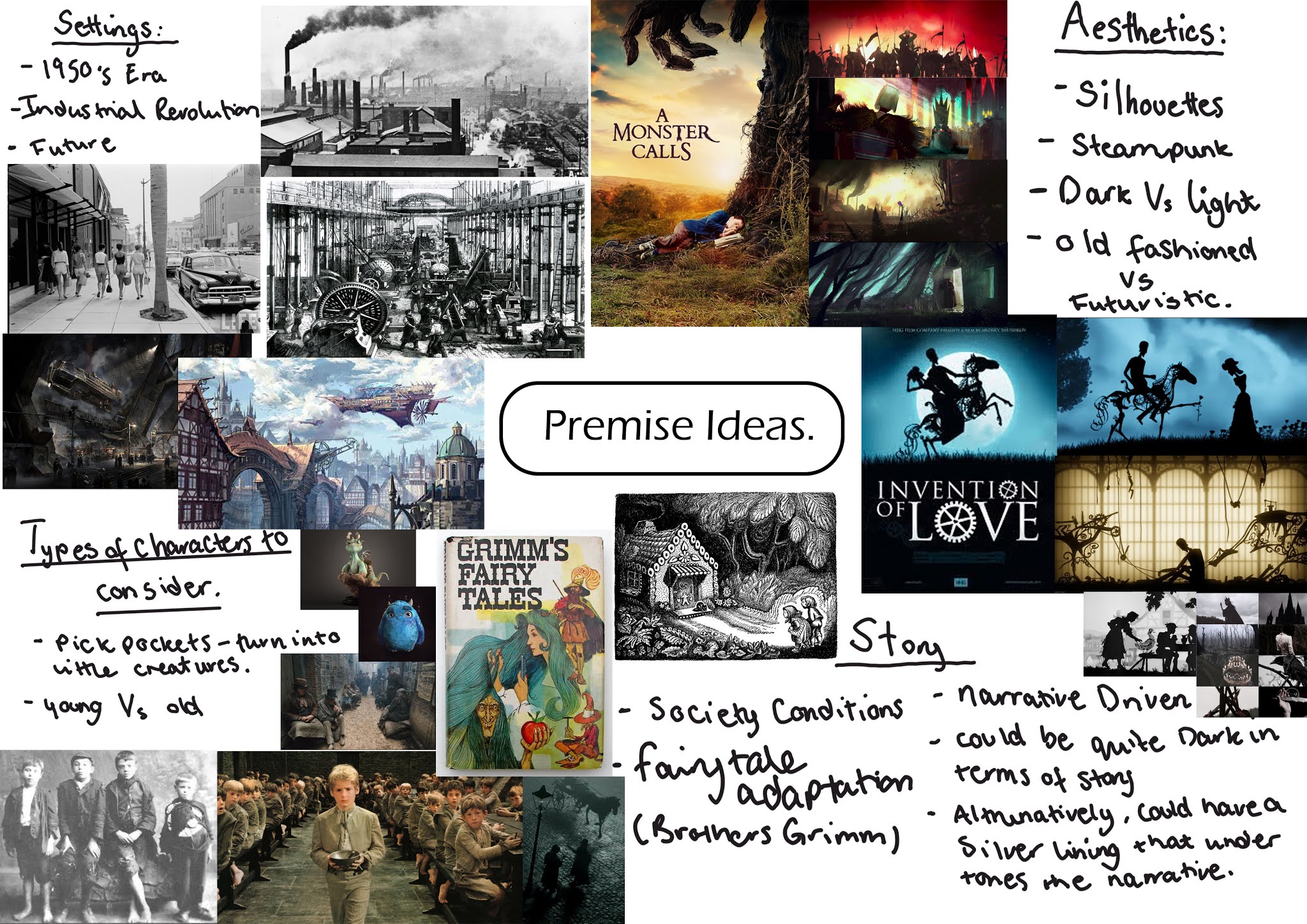
To kick start the new premise project I began by looking at the brief to see what is required for this new project. Through reading the criteria, I will be looking at the pre-production stages for creating an animated short. This will entail looking at story ideas, concept designs, world building and production designs. Premise Brief by Jasmine Masters For my Premise, initially I feel unsure on the direction I should take my ideas. From looking looking at animated shorts and the stylistic choices I wish to follow, I feel that I need to choose a storyline that suits the aesthetics I am aiming for. This being that of a silhouette, dark Vs light concept. Mind Mapping ideas: With the above mentioned ideas, I started to think of rough story outlines for my premise proposals.  With my second idea I thought of how narrated stories tend to work quite well with this silhouette aesthetic; which brought me onto looking at folklore stories. With these stories I find there is always a dark undert

Collaboration Project: Reflective Statement.

Image
For this collaboration project it was my role to try and organize the running of the overall group and trying to delegate tasks out for the group; trying my best to do so that it played to their strengths. From the time we got the email to find out who was in our group, straight away I sent an email out to everyone to try and get a kick start on designing the blog, which Kim kindly set up and put our graphic ideas together, Saskya with her illustrations for the logo and the 88 part of the title, Jess with the spelling of the studio name from the chameleon original spelling I came up with and me with laying out the logo into the format you see on the blog from Saskya's designs. - This I found to be a good warm up exercise before we came back as it allowed us to get a feel for each other’s work ethic and technical style, which I found useful for when it came to delegating tasks. Come the end I found the group as a whole worked together to get final decisions made; we constantly tried

Collaboration Film Reviews Submission Post.

  * Note : All film reviews come after the lecture notes in each post, so will have to scroll down to see review. Myth & Storytelling. Archetypes & Storytelling. Structural Theories & Storytelling. Time & Storytelling. Character & Storytelling. Quality & Storytelling Part 1 (B-Movies). Quality & Storytelling Part 2 (Exploitation).

Collaboration: ''Art Of.'' and Final Animation.

Image
The Worlds Worst CCTV Mishaps -By Khamaeleon 88 Productions.                         The Art of "The World's Worst CCTV Mishaps" 'Art Of' credit goes to Kimberley Davis.

Collaboration: Hotel Bellhop Animation: Tests and Editing.

Image
Continuing on with the Bellhop Skit, I looked at animating the second scene in the sequence.  This is where Moom Sr enters the hotel and Moom Jr is dancing as he attempts to load the luggage trolley. To start with I looked at animating Moom Junior's actions first to then be able to use that for Moom Senior reaction. Focusing on Moom jr animation. Focused on lifting the suit case. Focused on animating Moom Senior's walk cycle. Focused on cleaning up animation on Moom Senior's walk cycle.(removed foot snag seen in Test 3) Focused on snapping Moom Senior's feet to the ground and adding in arm movement to the walk. Clean animation on Moom Senior's walk cycle. - attached case to hand. From there I then proceeded to edit the clip in Premiere Pro and After Effects to help with timing and effects. To do this I used after effects to help slow down parts of Moom Jr and looked at adding static effects for a cleaner animation cut. Below is the rendered outcome of the scene.

Character Design Session #5

Image
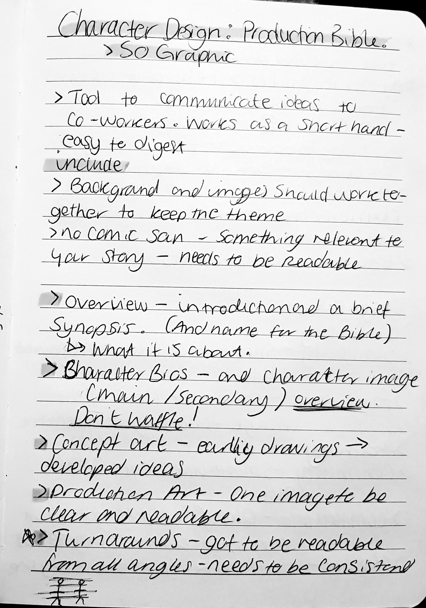
Today we looked at prepping for compiling our character designs into a easily digestible format - this being our production bibles - to demonstrate our ideas and scenarios for our character and the world they exist in. Given a creative challenge to design a logo based on the name given to us, where we had to incorporate the above mentioned techniques (Design Rules section). So for my character bible I'm planning too go along the theme of a scrap book and include bits and pieces in which my mouse has collected on his travels, I am also going to try and bring in a some sort of propaganda style to the book format. We were then given a second task, where we had to design a character that lives in an existing world. So for my group we were given Miraculous; which is a program about high-school student's having alter egos who then become superheroes and depending on the animal they turn into, it then determines the power they have. eg Lady Bug = luck, Cat Noir = bad luck . So for my

Collaboration: Texturing Moom Senior and Moom Junior Assets and UVs

Image
Finalized UV textures for our Moom Sr and Moon Jr  and their assets, these are now ready to be applied to our Moom rigs. Texturing Moom Senior and M... by Jasmine Masters   Composite Renders: Moom Senior. Moom Juniors Walkman. Moom Juniors Name Tag. Diner Moom. Bellhop Moom. Launderette Moom. Rendered Pose Stills

Collaboration Lecture: Preparation for Premise.

Image
Will be looking at the film lecture series to help aid in preparation for Premise. Film Lecture Series: #8 - Documentary  #9 - Adaptation, Transcription, & Biography. Documentary – Shockumentary, Mockumentary, Docudrama. Brief history into the scope of documentary: 1895 – Lumiere Brothers invent the Cinématographe motion picture system and ultimately one of the first to create a short film documenting a train pulling into a station called Un Train Arrivee (1895). This was filmed as a part of a travelling show to entertain audiences, as at the time it was created; motion picture was a new medium of capturing life events. Film shorts of this era were purely of documenting and experimenting with this new medium, so most things shot were of everyday life. It was only later that the medium was introduced as way of storytelling. Lumiere Brothers -  Un Train Arrivee (1895). 1922 – Nanook of the North – documents the day-to-day life of the Inuit’s and life in the cold conditions. With

Character Design Session #4

Image
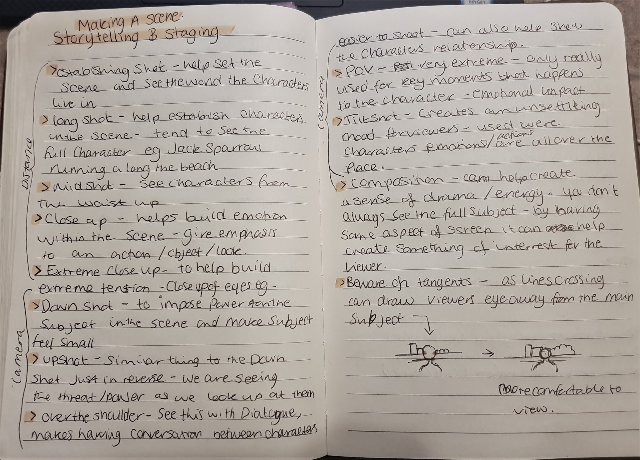
Today we looked at Storytelling, Staging, Acting and Animation Layouts.  Here we looked at the different distance shots and camera angles and how they can be used within a scene to help convey the mood and emotions to the viewer. In addition to this we also looked at composition of the scene and how some layouts are more suitable than others, for example; line tangents (where lines meet and overlap) in the scene can cause focus to be drawn away from the main subject. For this task, we looked at it in relation to our production bible projects. So for mine I looked at setting up the scene of a London skyline during the 1940  blitz's and an underground station being used as a bunker. From there we looked at how how characters inhabit the scenes/sets we create and making sure we are setting the right perspective for our shots as too low or too high may give off the wrong message and may not relate to our character. So, for example my character's a mouse, so his perspective of the w