Character Design Session #4
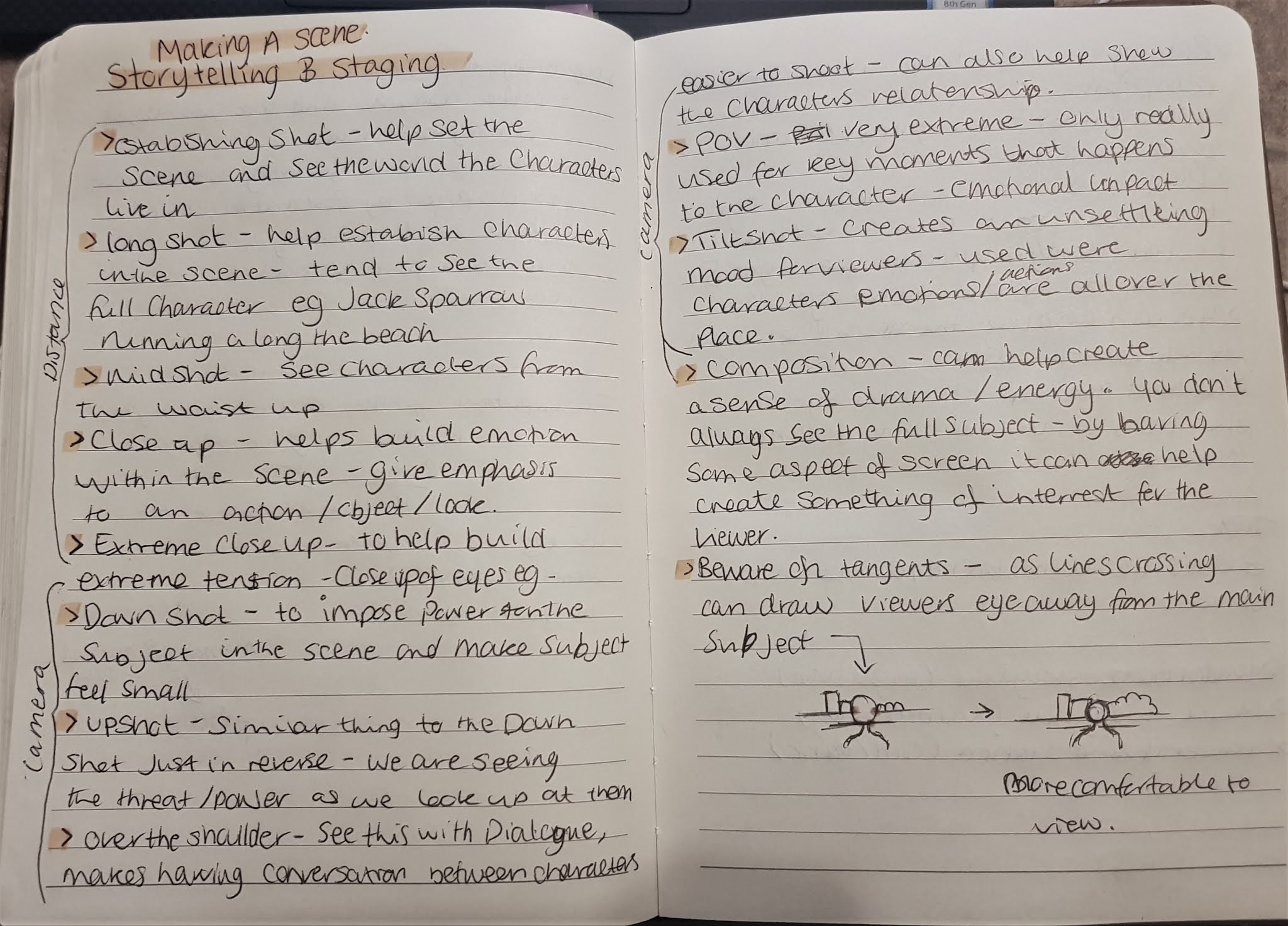
Today we looked at Storytelling, Staging, Acting and Animation Layouts.
Here we looked at the different distance shots and camera angles and how they can be used within a scene to help convey the mood and emotions to the viewer. In addition to this we also looked at composition of the scene and how some layouts are more suitable than others, for example; line tangents (where lines meet and overlap) in the scene can cause focus to be drawn away from the main subject.
For this task, we looked at it in relation to our production bible projects. So for mine I looked at setting up the scene of a London skyline during the 1940 blitz's and an underground station being used as a bunker.
From there we looked at how how characters inhabit the scenes/sets we create and making sure we are setting the right perspective for our shots as too low or too high may give off the wrong message and may not relate to our character. So, for example my character's a mouse, so his perspective of the world would appear to always be looking up at his surroundings.
Here I also considered how I could do an Animation Layout using my developed riverside scene. (listed in last Lecture Notes page)
With perspective I found it hard to do on photoshop as felt restricted and hard to grasp the dimensions, so moved to paper and found this much easier to conceptualize my ideas.


Comments
Post a Comment