Bringing together learnt animation principles.
Bringing together all previously learnt animation principles, I looked to create a short that incorporated: timing and spacing, squash and stretch, arcs, weight, ease in and ease out, secondary action and consistent 'solid drawing' throughout. With this I designed the background and set props in Photoshop and then imported these into Adobe Animate to then apply the following effects to.
 |
| Designed concept in Photoshop. |
 | ||
| Animated design in Animate. |
The Disney 12 Basic Principles of Animation.
1. Squash & Stretch: Is a principle that is designed to give the impression of mass (weight) and capacity (volume) to an object. In this case being applied to a character as they transition from one frame to the next; this is usually done by either expanding or compressing said character/objects main form.
2. Anticipation: This factor is used to inform the viewers that an extensive action is about to occur; smaller actions with often be implemented into the movement before the main action happens to allude to the bigger gesture.
3. Staging: Staging in this case is to do with the pose or action the character makes; that then is a way to further project how the characters are feeling. Staging can also apply to camera position placed upon the subject.
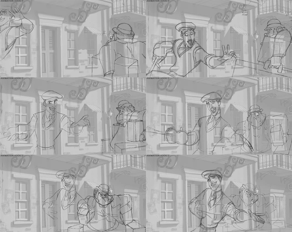
4. Straight Ahead and Pose to Pose: Straight ahead and pose to pose involves the transitional stages between the key poses that the character takes and then filling the missing frames from pose A to pose B. The straight ahead is usually for creating fluid, realistic movements; where as pose to pose is more theatrical in the sense of conveying a dramatic/emotional scenes.
5. Follow Through and Overlapping Action: Is the principle that challenges when a characters stops after a fast fluid action, not everything comes to a halt. For example if a character is running and suddenly stops, other body parts like the arms or legs may have a jerk reaction and file about before they come to a stop; this is knowN as a follow through action. Overlapping however, focuses more the idea of the character in motion and how some parts appear to move faster or slower than other parts.
6. Slow-In and Slow-Out: Is a principle created to add a realistic quality to the characters actions; meaning more frames will be drawn at the beginning and at the end of a sequence with fewer frames in the middle to show the quickening movements.
7. The Arc: Most actions consist of using a circular motion; these are known as arcs. Arms and head movements being an example; will often move with a slight curve and won't jut in and out sharply.
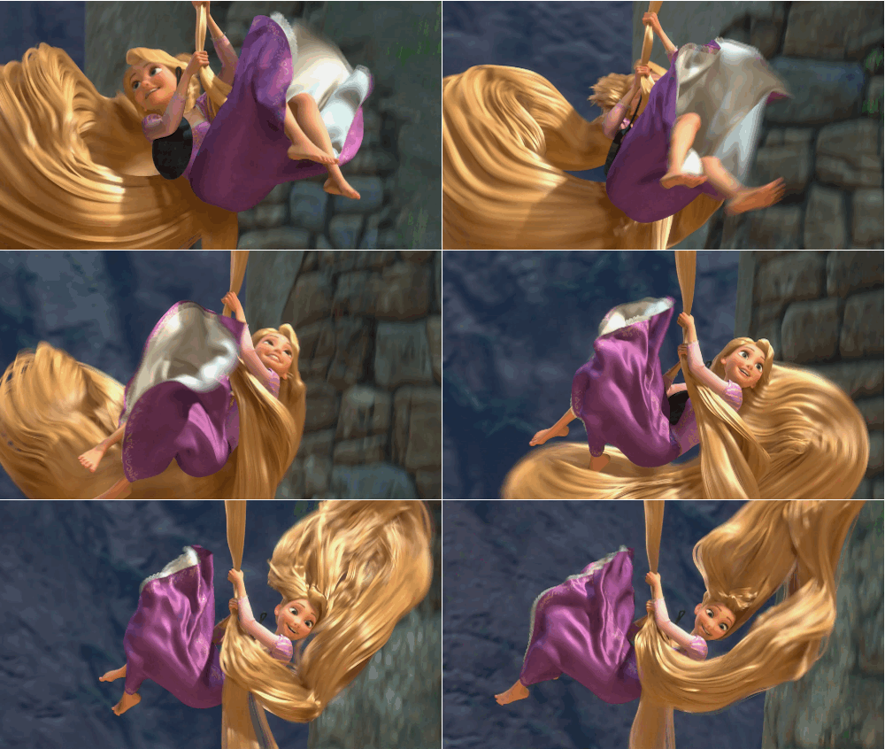
8. Secondary Action: Is an additional transition applied to reinforce and add further character and dimension to the subject at hand. As seen in the skirts swishing motion below.
9. Timing: Timing can be used to enforce the illusion of how fast something is going while following the laws of physics. Through altering the time in a scene it can make a subject appear slower and more refined with the addition of more frames; or faster through removing frames in a scene.
10. Exaggeration: Is about over emphasizing certain movements so that it pin-points a certain reaction, but not so much that it disrupts the realism of the actions.
11. Solid Drawing: This idea encourages animators to take into account what they are drawing and how they should be shown in a 2D space; but be mindful of its 3D appeal.
12. Appeal: Not very character has to be appealing; but this principle lies on the fact that animators should look to create images that not only intrigue and interest audiences, but evoke a response as well.


Comments
Post a Comment